Our goal was to build an experience that would appeal to the brightest minds, captivating & motivating those interested in a career at Aviva, and shift perceptions of the organisation through rich, engaging and immersive content.

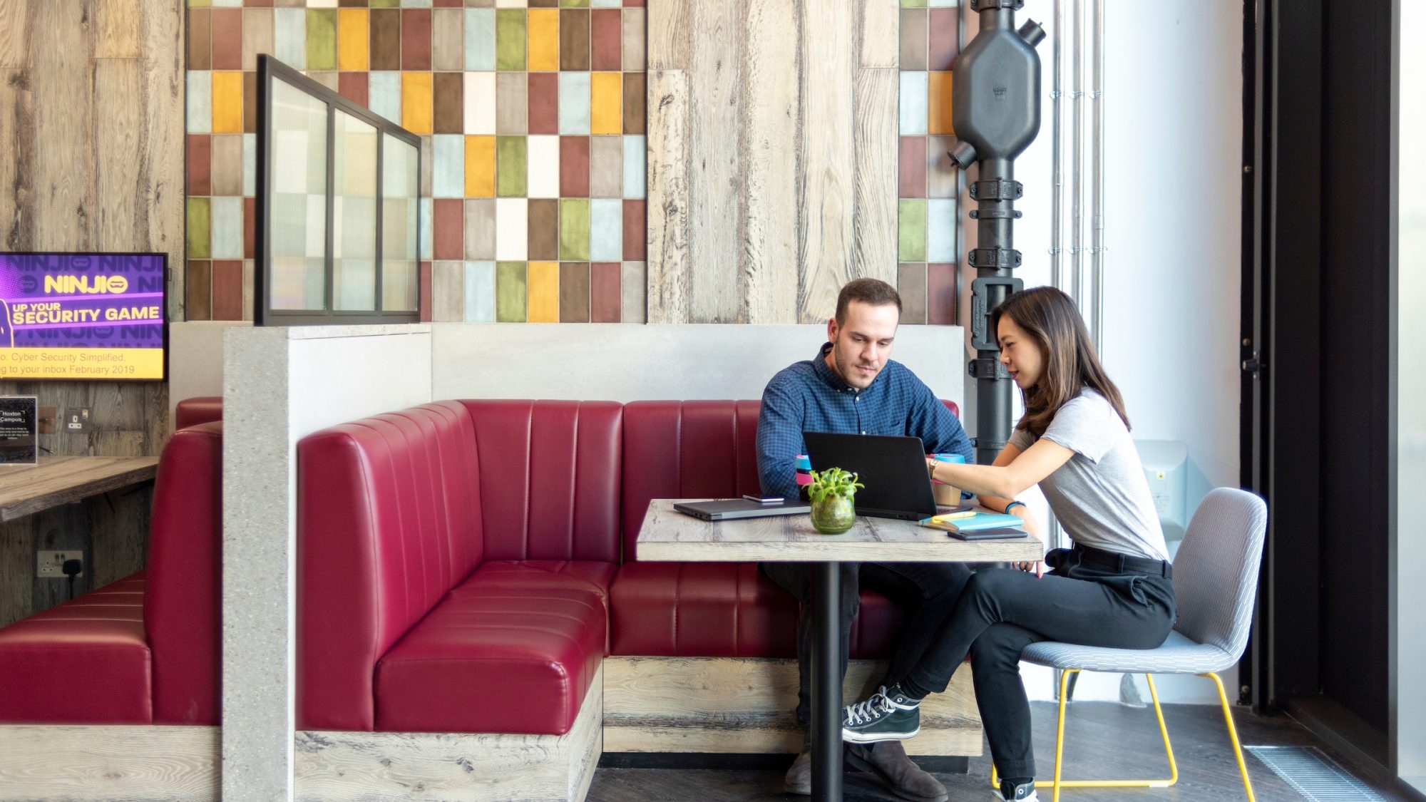
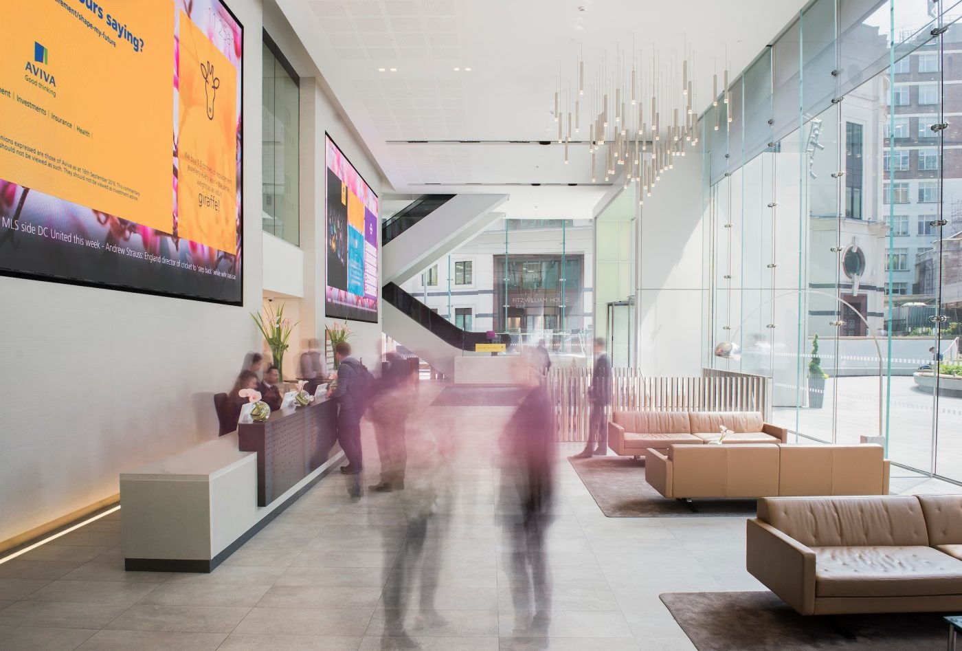
Insight was behind every move we made. We built a team of experts to inform, define and develop a strong, compelling EVP with a confident message at its core.

Our focus was to show, not tell, people what it was like to work at Aviva. We created a suite of images featuring real employees at work that succeeded in breathing life and personality into the website. The new design delivered authenticity at its core, and felt true to the working culture at Aviva.
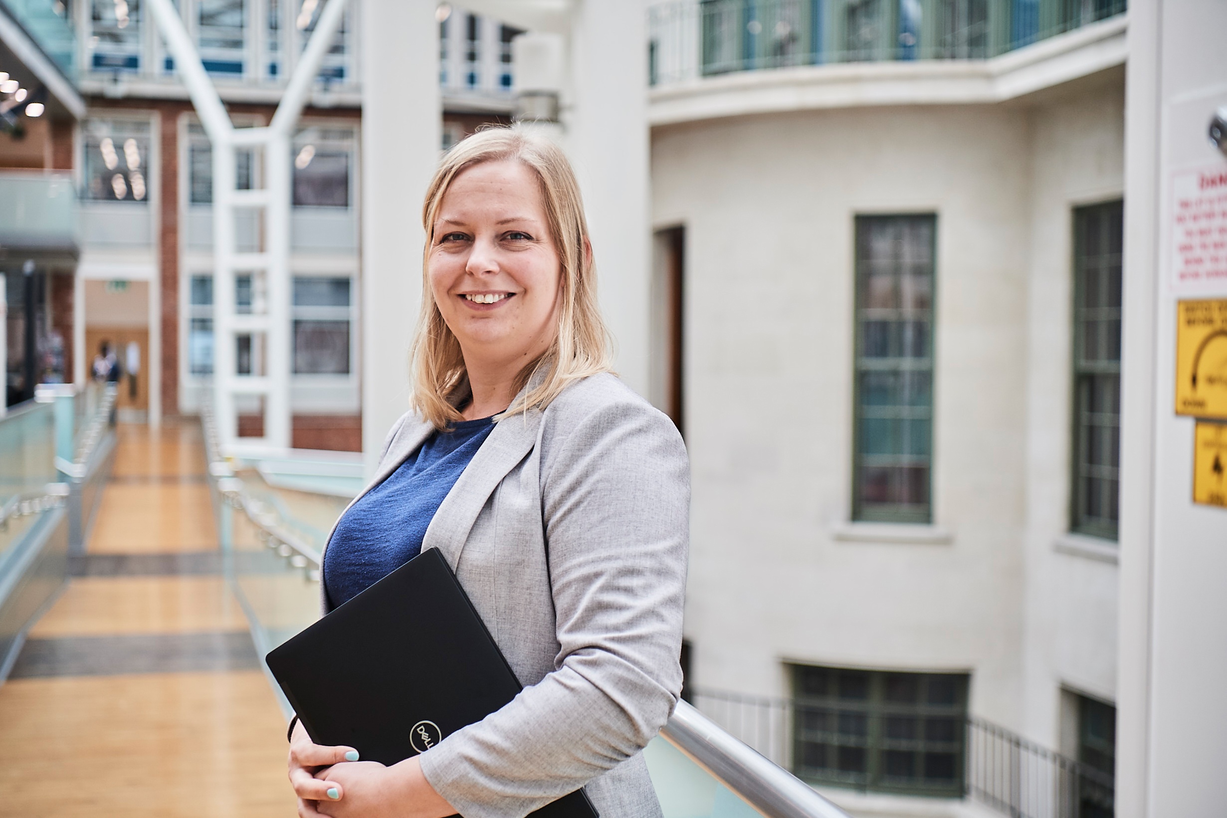
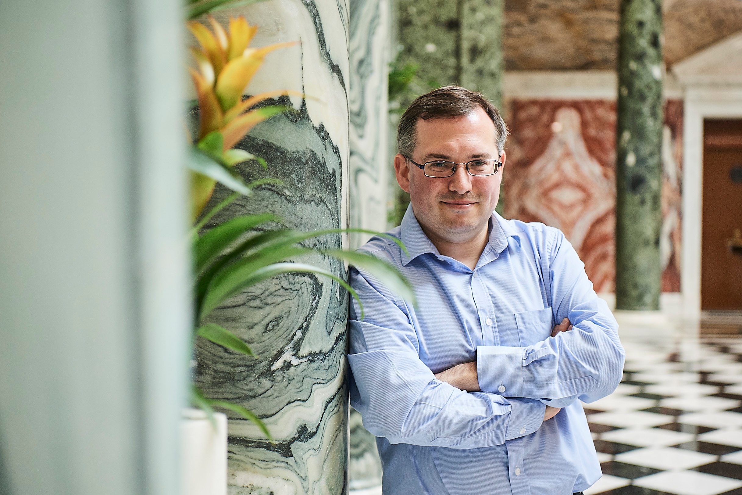
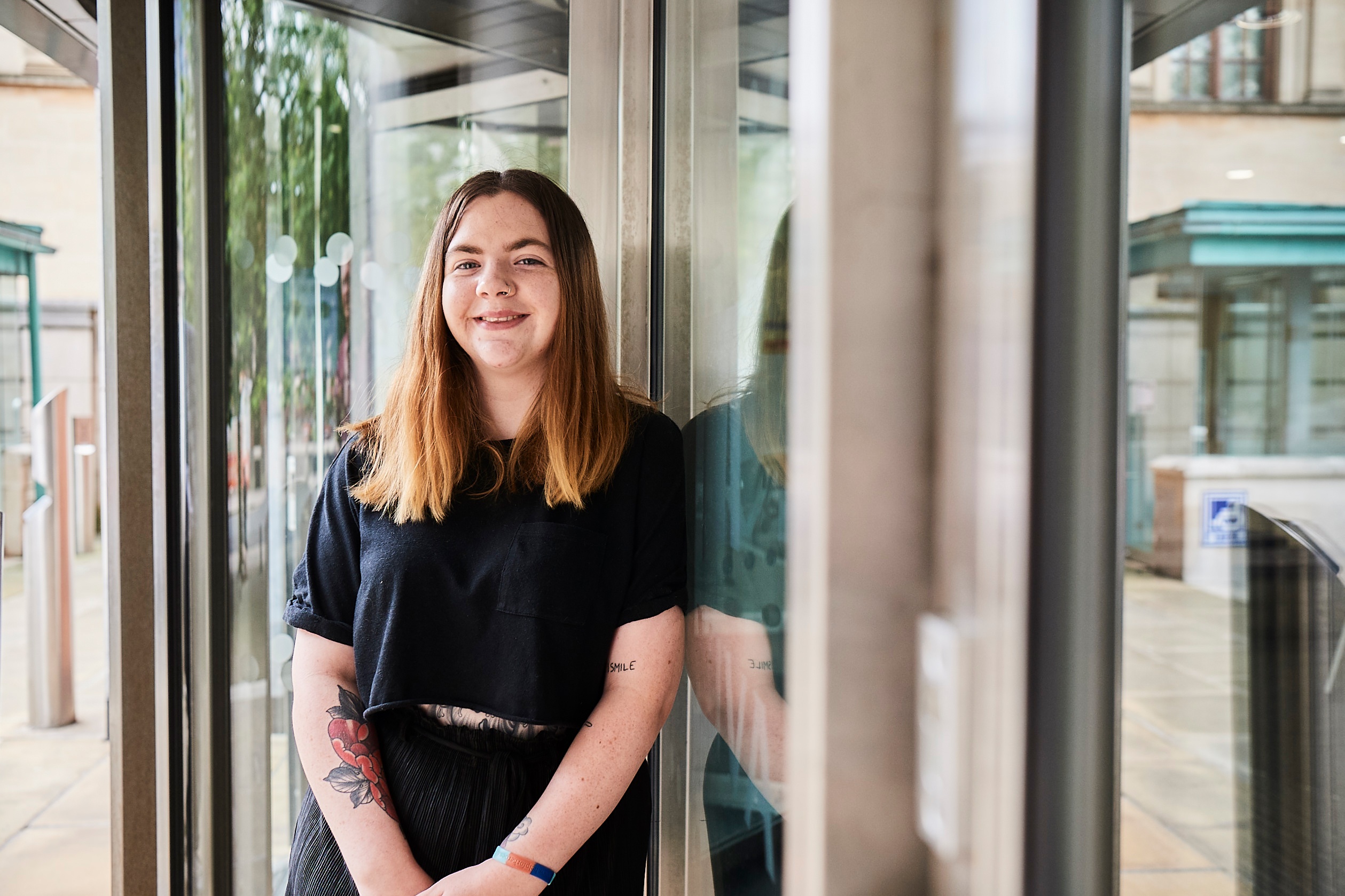
To enhance the user experience, we introduced cinemagraphic imagery which added intrigue and interest to the user by bringing Aviva’s employees to life with the smallest movements – a strand of hair on a shoulder, a flutter of a leaf in the grass.
We undertook a full custom integration with Aviva’s applicant tracking system (Workday) that allowed us to display roles to our audience in context, enabling users to quickly and easily identify opportunities relevant to their needs.
This tone had to stand out in a crowded market. It had to be bold and different. The new website read like a message from a good friend – it was relatable, personable and excited for the road ahead.
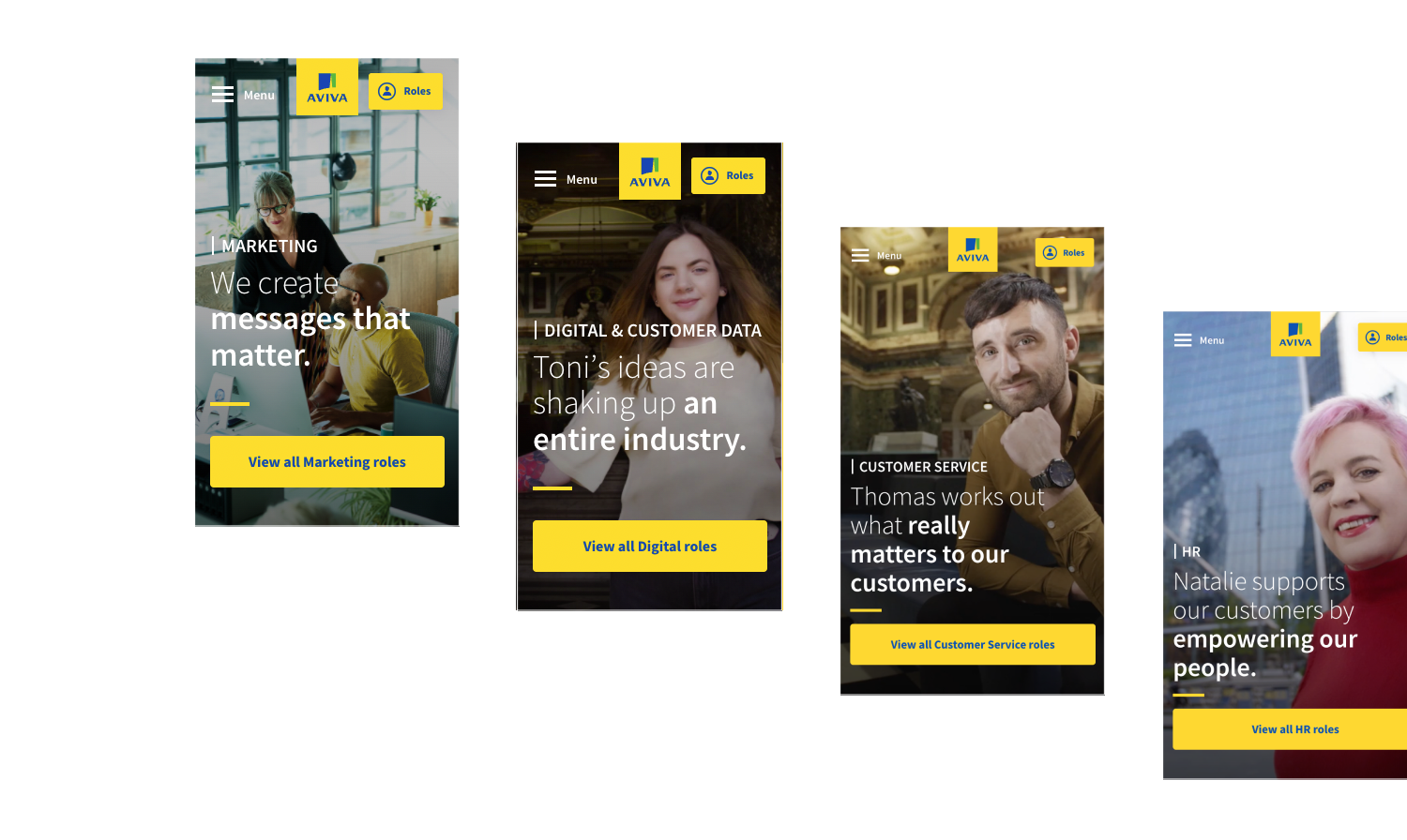
It was important that flexibility was key. The site needed to grow and adapt as the needs of the business changed. A modular approach ensures Aviva are able to promote key content quickly and easily, such as the example below, sharing Aviva's belief that anyone could, and should consider a career in tech.
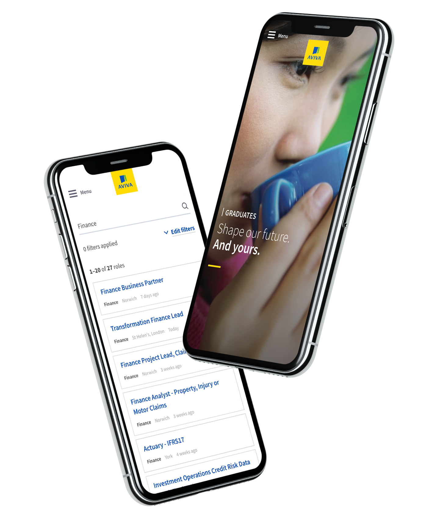
Aviva’s new careers website has been a resounding success. The tone, imagery and creative content delivery has set Aviva up for the future, building on their 300 year heritage as a brand of choice for both customers & employees.
Users - 33% increase year-on-year
increase in pages viewed per session
increase in average session duration